
Week – 1
- This being the first class of the second semester, we first revised what we had learned in the first semester.
- We went over the various tools and shortcuts we had learned in illustrator and photoshop.
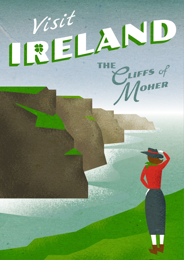
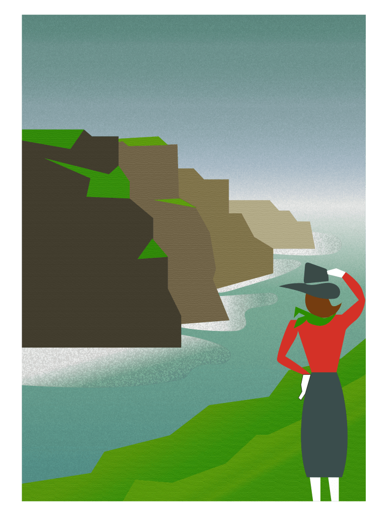
- We were then asked to recreate a poster using both the softwares. This poster required us to use tools like the pentool, shapes tool, curve tool, brush tool and also had to have multiple layers. It also consisted of effects mainly a grunge effect that gives it a vintage look.
Week – 2
- This week we started to learn about a new software called InDesign. I learned that it is quite similar to illustrator and photoshop, which made it easier for me to figure my way around it.
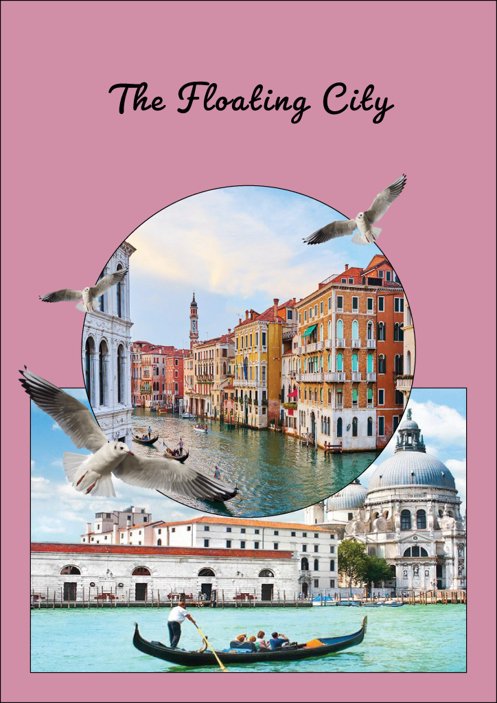
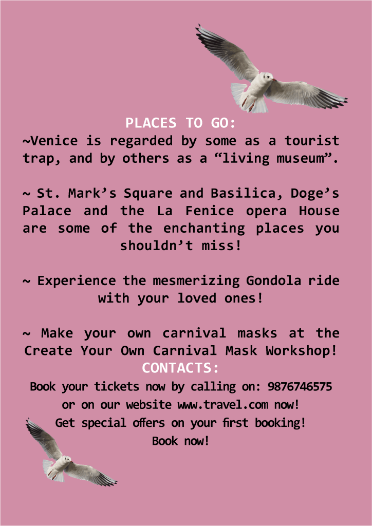
- We learned the basic tools of InDesign and started off with the first assignment : making a tourist leaflet.
- For my leaflet I chose the city of Venice which is also known as The Floating City.
- The front side of the leaflet consisted of pictures and the back side had all the information.
Week – 3
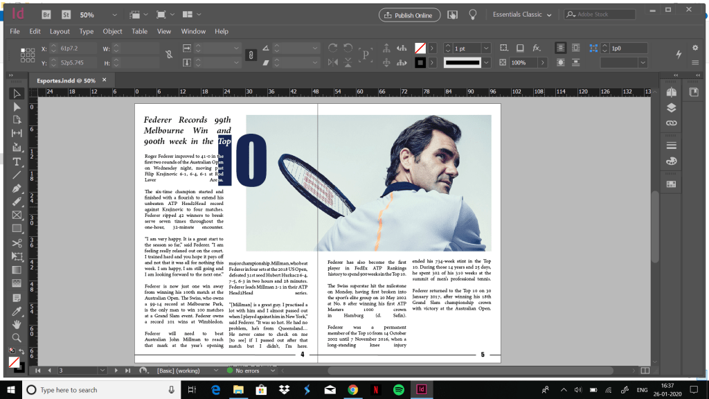
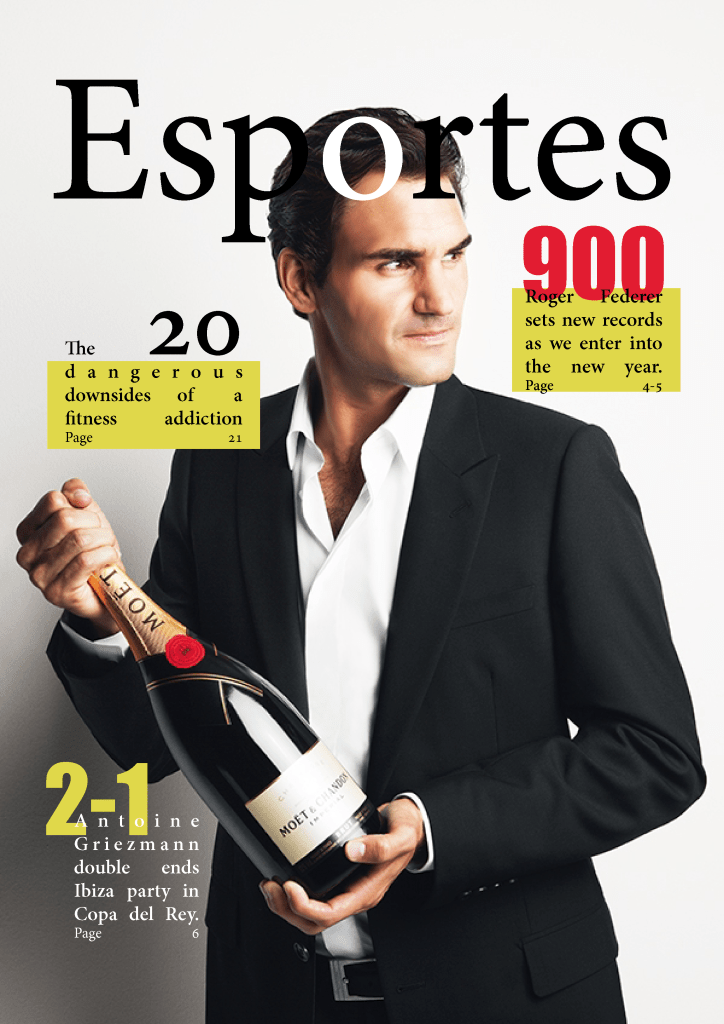
- This week I created a layout for a magazine article.
- This article had to extend to 2 pages i.e be on facing pages.
- I chose to do so with an article on my favourite tennis player : Roger Federer. I had so much fun making doing the layout for this magazine that I even decided to make a magazine cover to go along with it.
Week – 4
- A layout is a way of arranging contents in proper format on a page.
- A layout of an article in a magazine or a story in a book always has a proper arrangement no matter how different they are. Having a proper layout grabs the reader’s attention and keeps them interested.
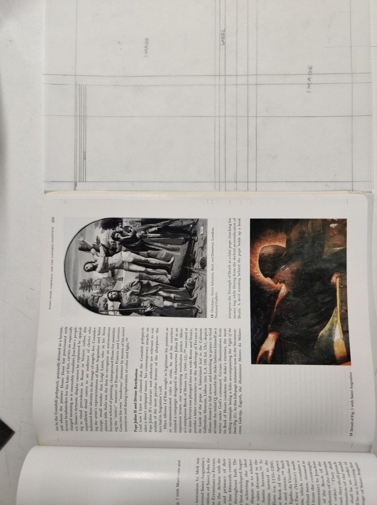
- This week, we traced the layouts of either a magazine article or a book story.
- This process was a bit tedious but it taught me the importance of a layout.

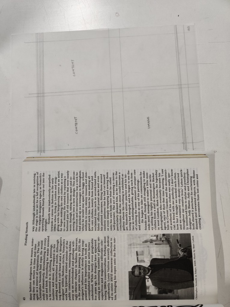
The picture is smaller but still quite prominent. The text is left align just like the previous one.
Week – 5
- This week in class, we started to make the cover for our books.
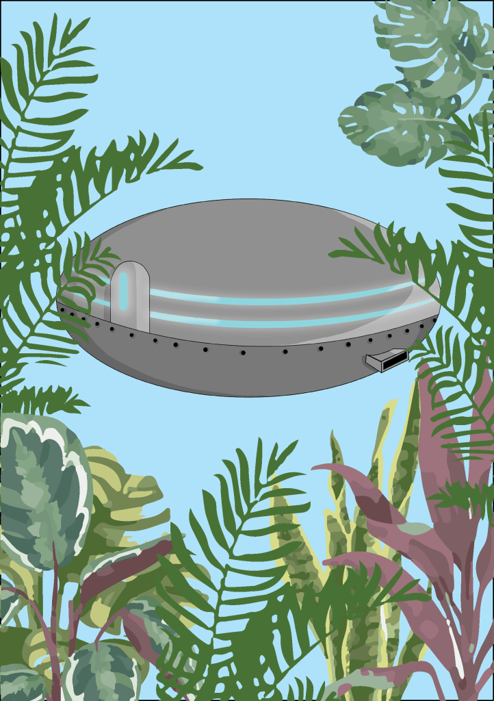
- I decided to include various elements from my story. I wanted to show the floating houses and greenery because these are the main elements of my city.
- I started off by designing the floating houses. I wanted them to look futuristic and aesthetic. I took reference from various posters for sci-fi movies which helped me come up with the design for my floating house.
- I then designed a cover for the book using these houses.
Week – 6
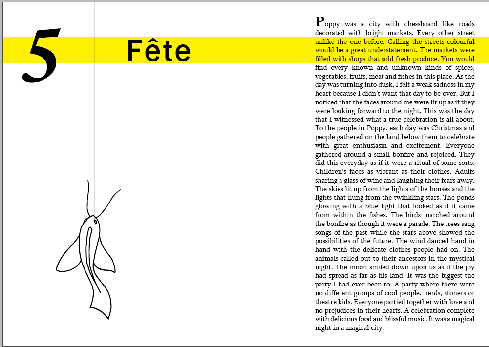
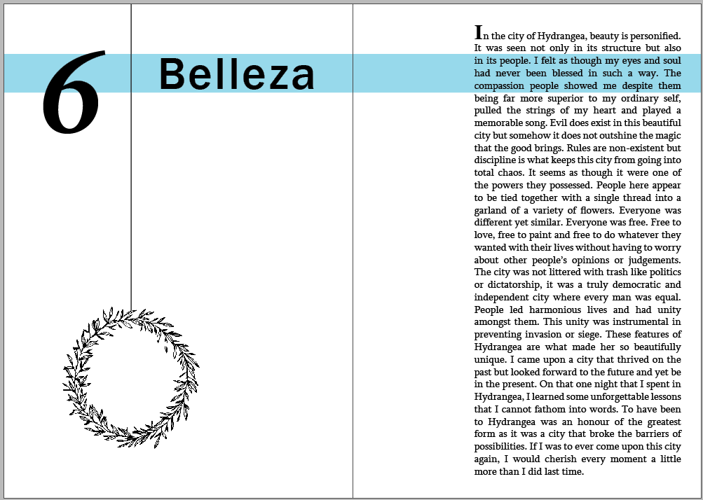
- In this week’s class I started to make layout options for my book. I then chose the one that I liked the most and started placing my chapters in that format.
- I included some small illustrations for each chapter as well. These illustrations were of the main elements of the particular chapters.
- I kept the layout of my book minimalistic and simple, which is what appealed to me.
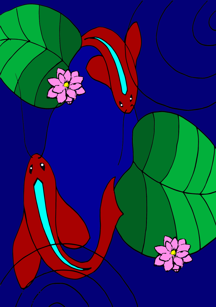
- I also remade my cover as I was not quite happy with the previous one. In this cover, I included some elements of the city like the pond and the glowing fishes. I used one of the compositions that I made for my studio class and put colors into it using photoshop.
Week – 7
- Having been absent for this week’s class, this post is based on my understanding of the class through my peers.
- This week we continued working on our layouts for our books.
- Once the designs for the cover and the content inside, we had them approved by ma’am so that we could get them printed for next class.
Week – 8
- This class, I finalized my layouts and designs and got them printed.
- After printing the final format, I realized that there are various factors that I should consider various factors while printing them like : the aligning of my text and the illustrations, the file setup and the quality of the printer.
- The following file is my final book layout:
Week – 9
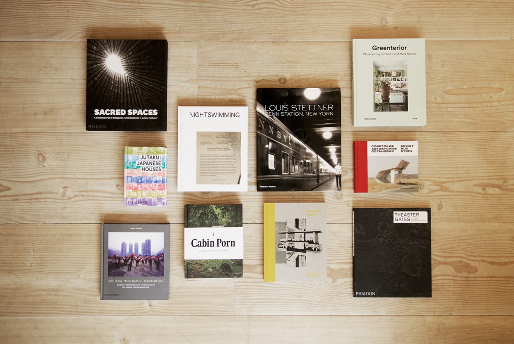
- This week we started to work on our coffee table book.
- A coffee table book is an oversized, usually hard-covered book whose purpose is for display on a table intended for use in an area in which one entertains guests and from which it can serve to inspire conversation or pass the time. Subject matter is predominantly non-fictional and pictoral. It has more of visuals and less of text.
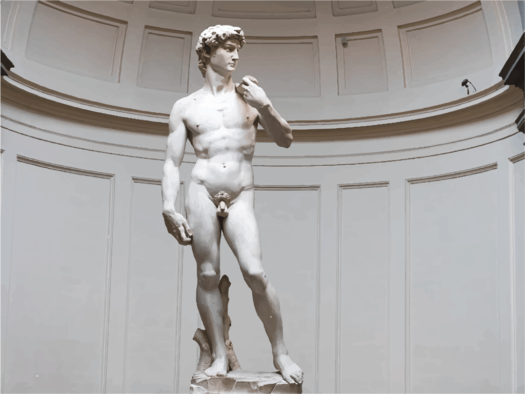
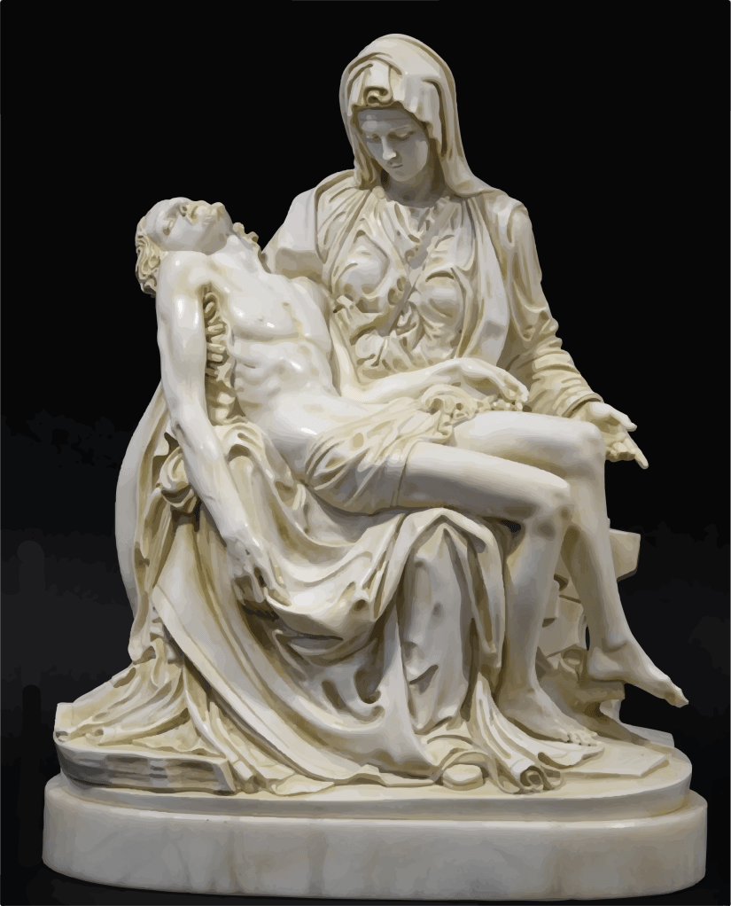
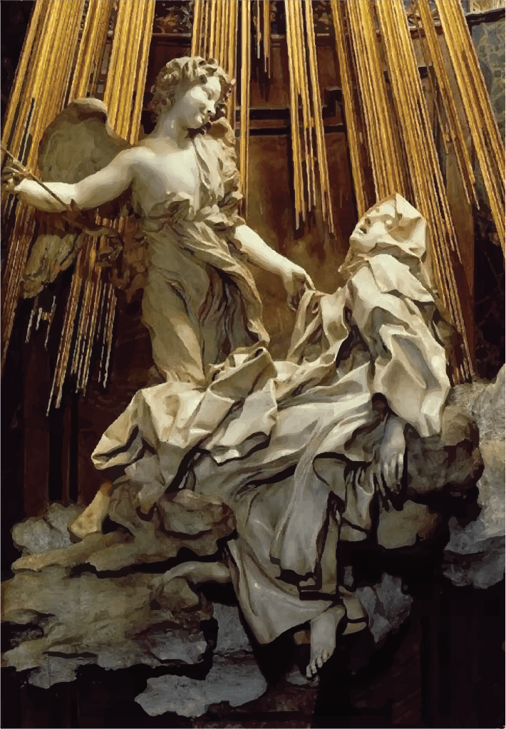
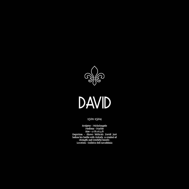
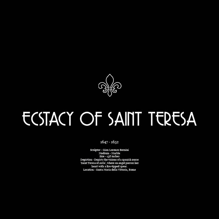
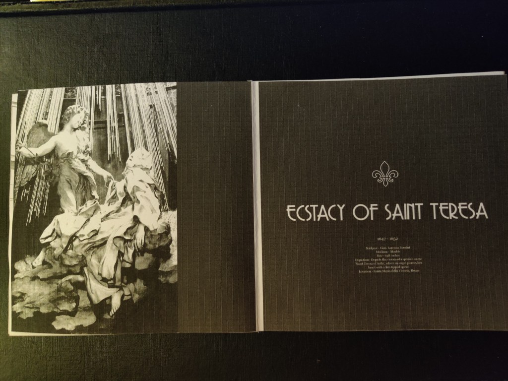
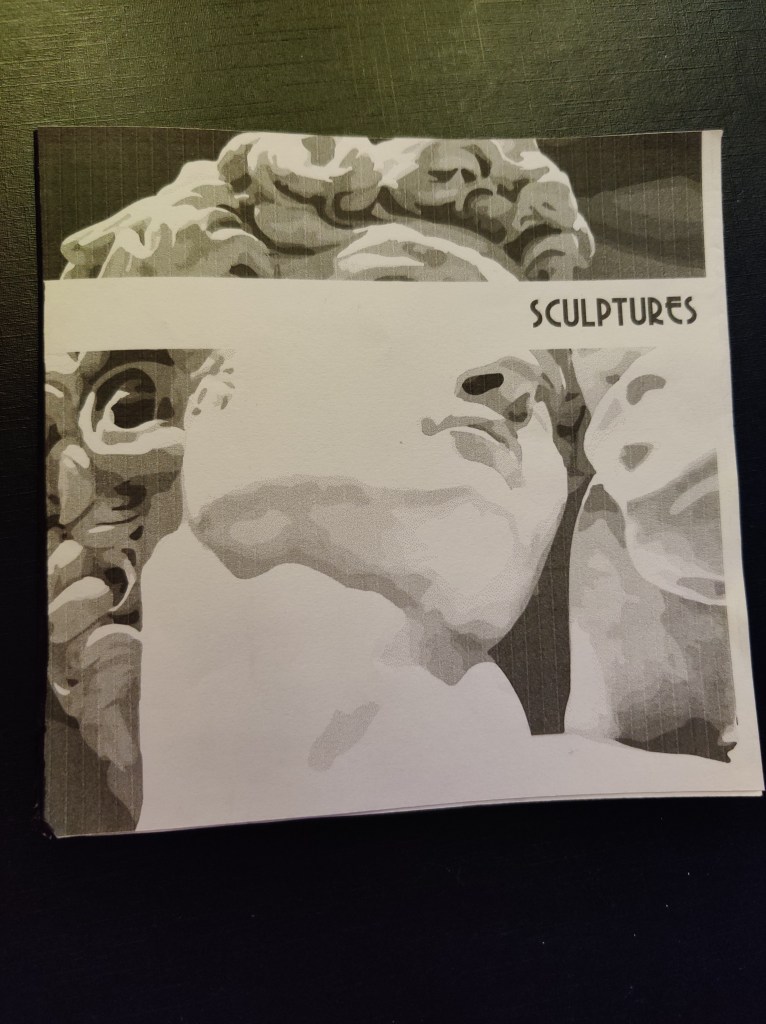
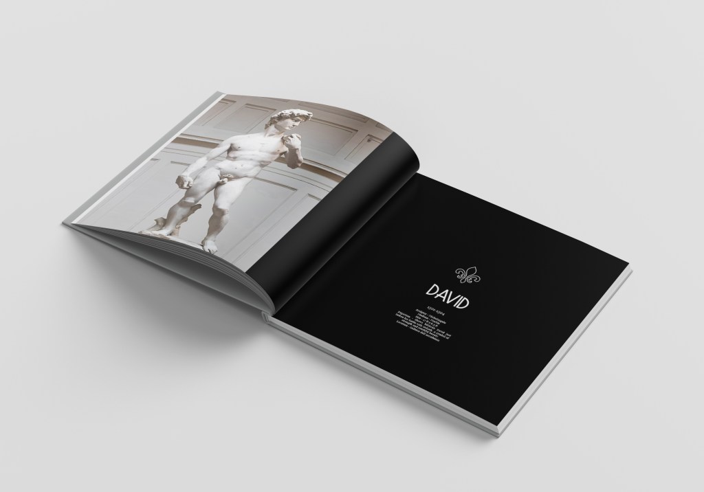
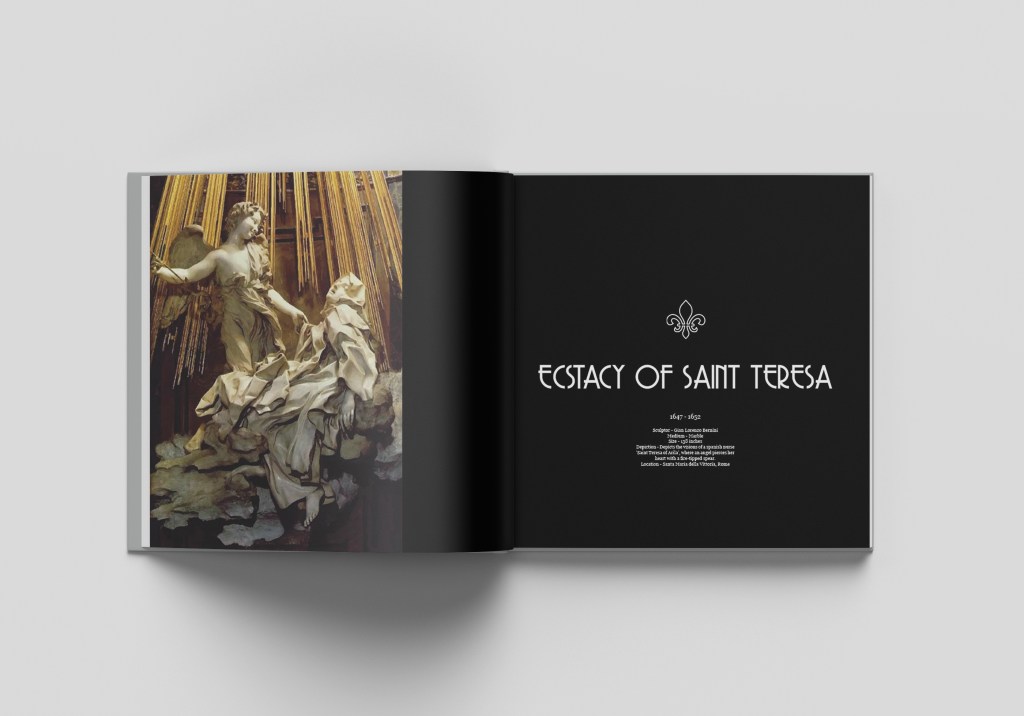
- I started to do research for my book. I decided to do my book on sculptures.
- I have always been amused by Sculptures. They have the incredible ability of story-telling through their beauty and skill.
- I chose to do sculptures done by Italian, Roman, French and Greek sculptors as they were the highlights in history.
Week – 10
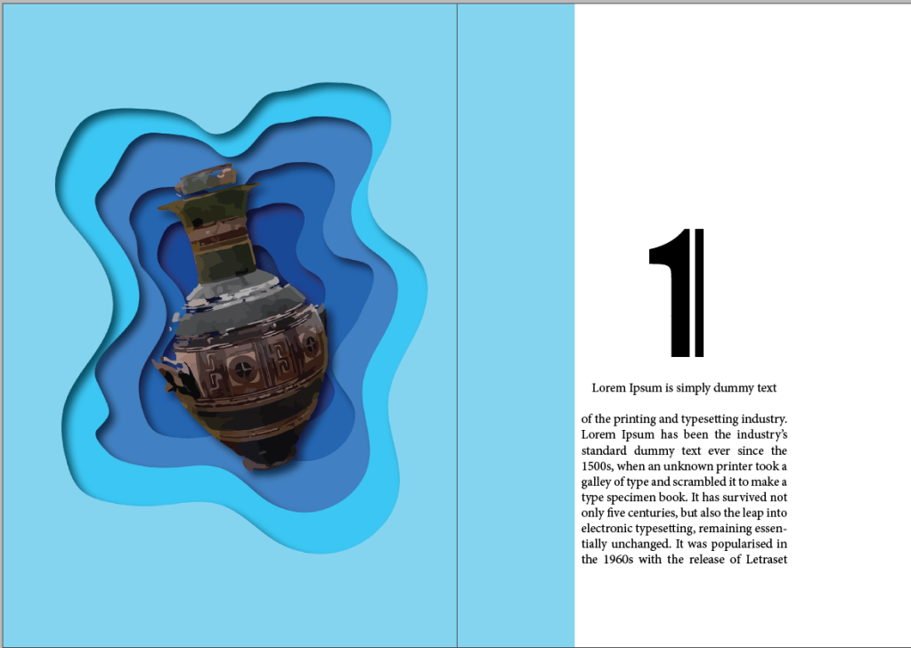
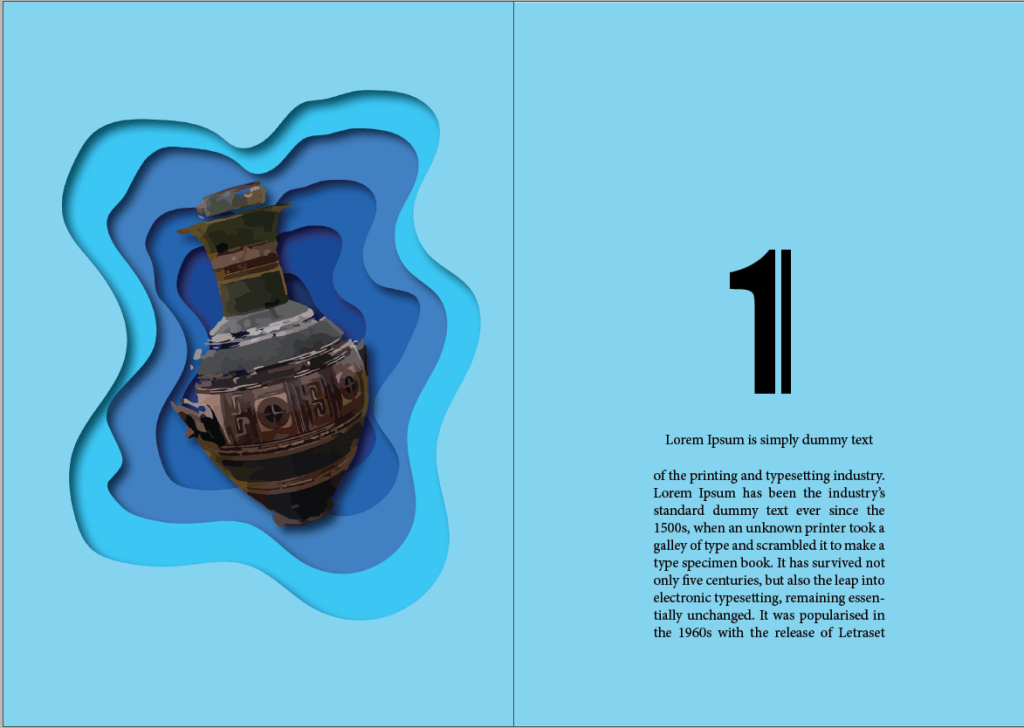
- This week I started to work on my layouts with images and text.
- I wanted to keep my layouts simple and minimalistic.
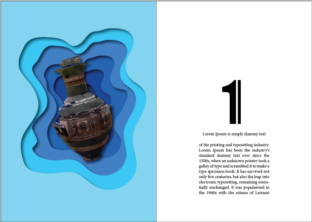
- I made 3 iterations including a placeholder text and image. I decided to go with the 3rd iteration as I thought it would work well with my object.
- The following are my iterations.
Week – 11
- This week I started to Put together my information.
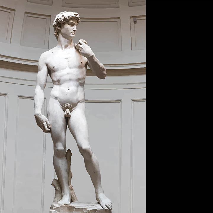
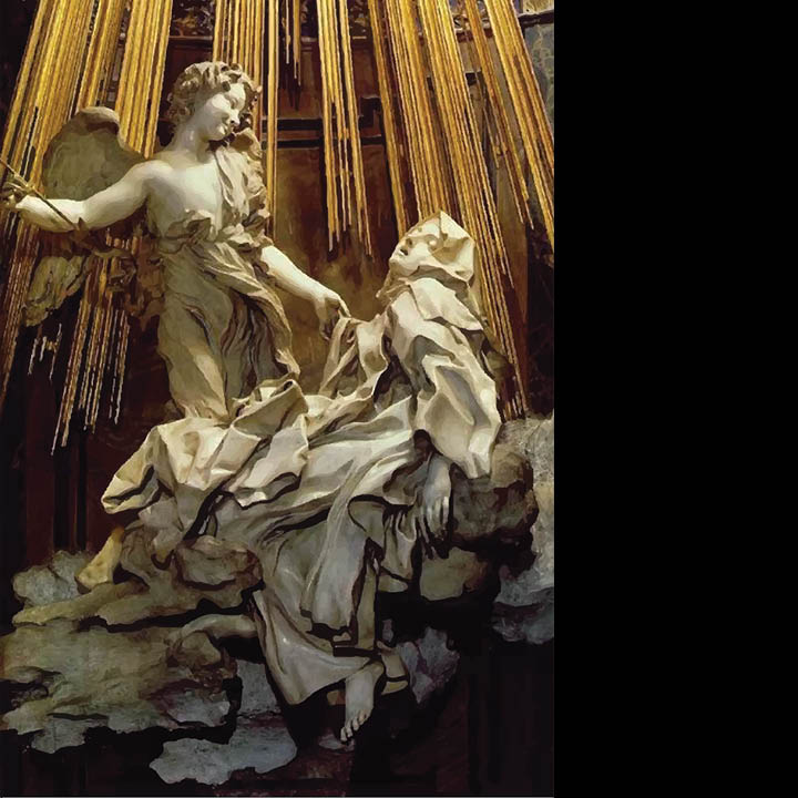
- I first Image traced the images of my sculptures as not all of them were of good quality and I wanted uniformity in my pictures.
- I then placed these images on my layout.
- At first I started off with a basic white background but I realized that my sculptures will standout if my background was black as the sculptures themselves were light colored.
Week – 12
- In this week’s class, I completed my lay-outing for the coffee table book.
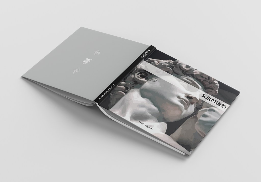
- While making the layout, I realized that I didn’t want to number my chapters. I, hence, replaced the numbers with symbols that represented the places these sculptures belonged to.
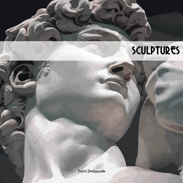
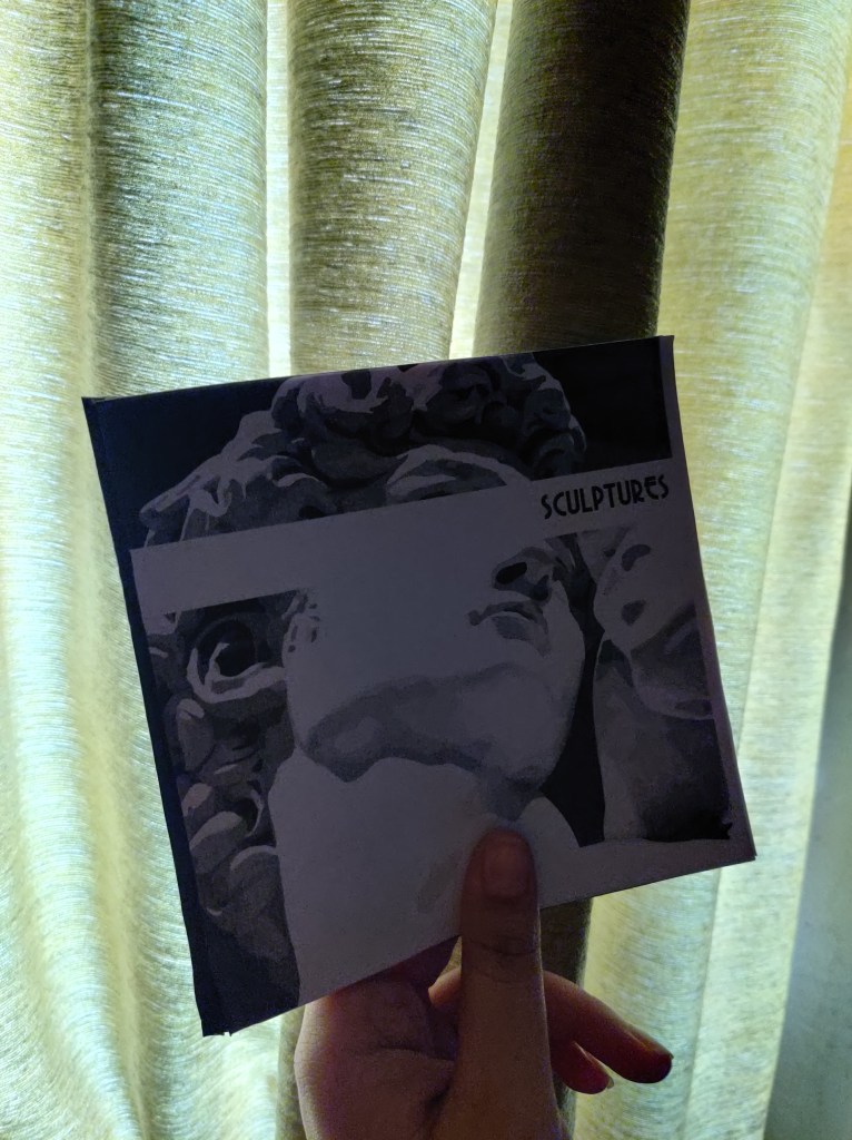
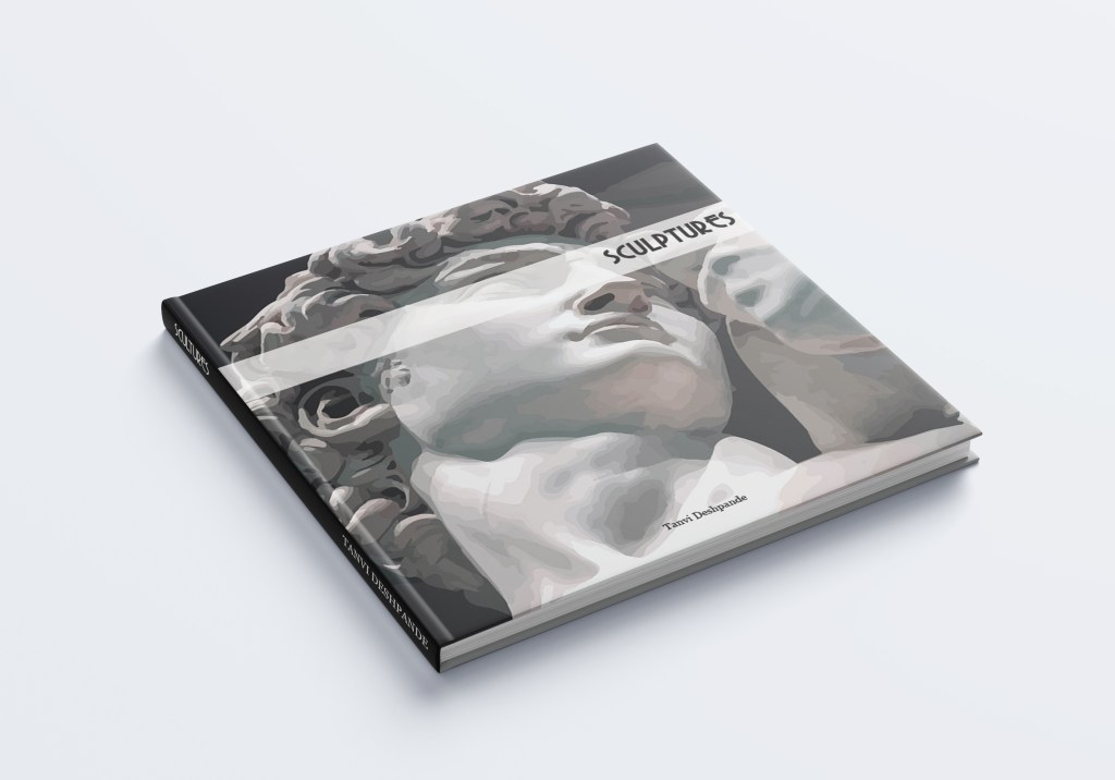
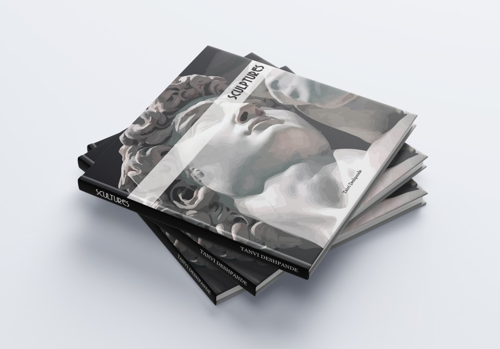
- I made a cover using a close up shot of one of the sculptures “David”. I wanted to keep it simple to match my layout.
Week – 13
- This week I started to make my prototype for my book.
- I printed out my layouts and then did a back to back binding.
- It was interesting to learn how to bind a book on your own when you don’t have any resources at your disposal.

Week – 14
- In this week’s class, I made a mockup of my coffee table book.
- I downloaded templates and then placed my content on it.
- This was a nice learning experience as I had never before done mockups and it also gave me a sense of how my book will look.
- The following are mockups showing how my cover and the pages will look.
Week – 15
This week was the review week. I was extremely happy with my coffee table book and was confident that I had made it to the best of my abilities. I was elated to get a very positive feedback for my book. Looking at others’ designs and the feedback that they were given, gave me a lot of insight on how a coffee table book should be made, what works and what what doesn’t work. The following is a pdf of my layout for the book.
