The class started off with the discussion of what digital media means. Digital media is anything that is created, viewed and distributed digitally. Blogs, GIFs, social media, digital audio, videos, etc. are the examples of digital media. Then we were introduced to Adobe Illustrator.
I had heard about Adobe softwares and initially I was overwhelmed by it but this was the first time I was truly introduced to it.
For the first class, I learned various tools like select tool, direct select tool, pen tool, shape tool and pathfinder thus learning how to make shapes, give colour and effects.
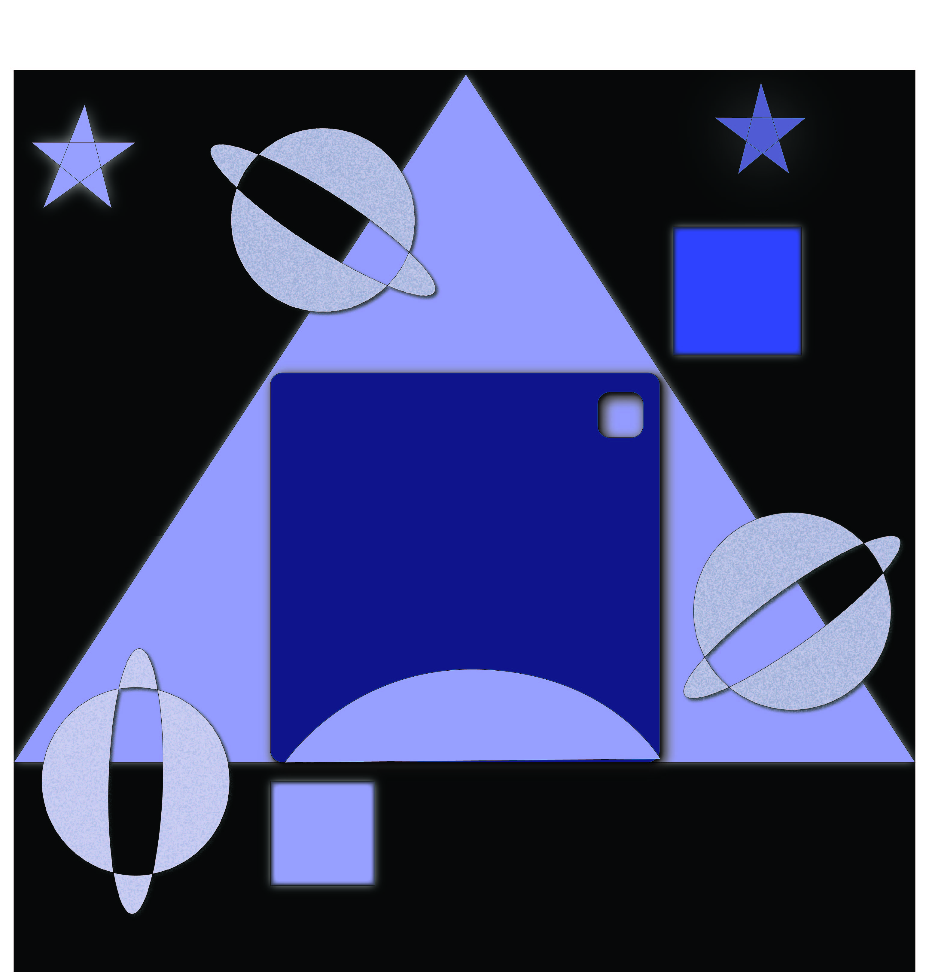
We were assigned to make a composition using 3 squares, 2 circles, 1 triangle, 3 ellipses, 5 curved lines, 4 straight lines and 2 stars using the information given in the class.
At the end of the class I realized that even though there are a myriad of things to learn about Adobe Illustrator, patience and an ever present curiosity to learn more will make it a smooth sailing journey.
ASSIGNMENT 1
WEEK – 2
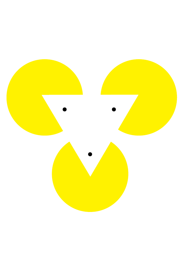
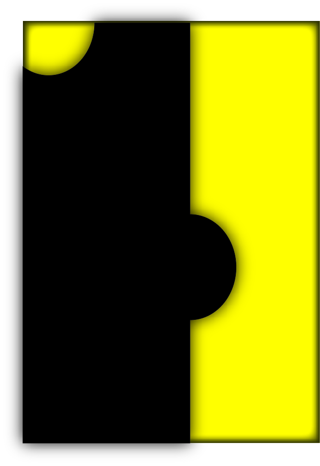
I was introduced to the concept of Gestalt and its importance in making any kind of composition.
Gestalt has 7 principles : Figure-Ground segregation, Closure, Proximity, Continuity, Similarity, Past Experience and Symmetry/Equilibrium.
I then practiced the Gestalt principles by making compositions and logos.
I learnt the importance of negative space and establishing a flow in my compositions. The very first project was assigned to us – Making a poster using the Gestalt principle
WEEK -3
The class started off with the revision of the various tools taught to us in previous classes.
This week I learnt a few more tools on illustrator. Some of them being the curve tool, the brush tool and many more.
The second poster was assigned to us : to make a poster using all the tools and effects taught to us thus far.
WEEK – 4
During this week’s class we learnt a few more tools on ilustrator but before that we revised the previous weeks’ tools.
I learnt how to make symbols and apply them.
How to trace images and make them look really interesting and use those images to make posters and various other things.
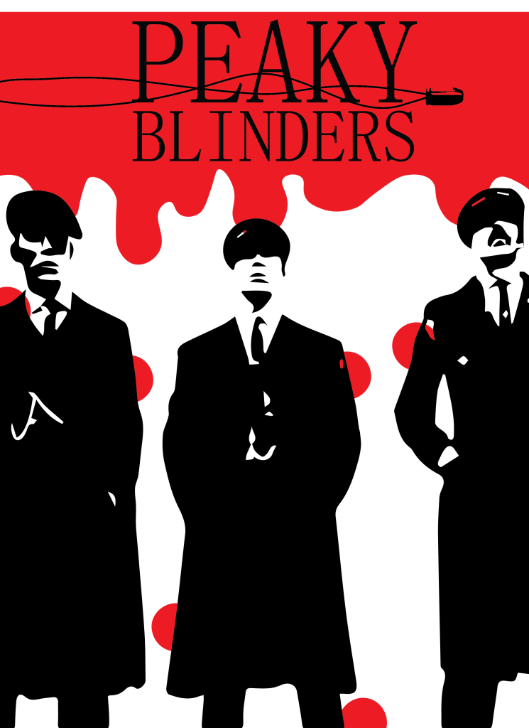
As I was to start working on my poster, my brain was gushing with ideas and I didn’t know where to begin. I finally decided to make a poster for one of my favourite TV shows – Peaky Blinders.
WEEK – 5
This week we went through all the tools of illustrator.
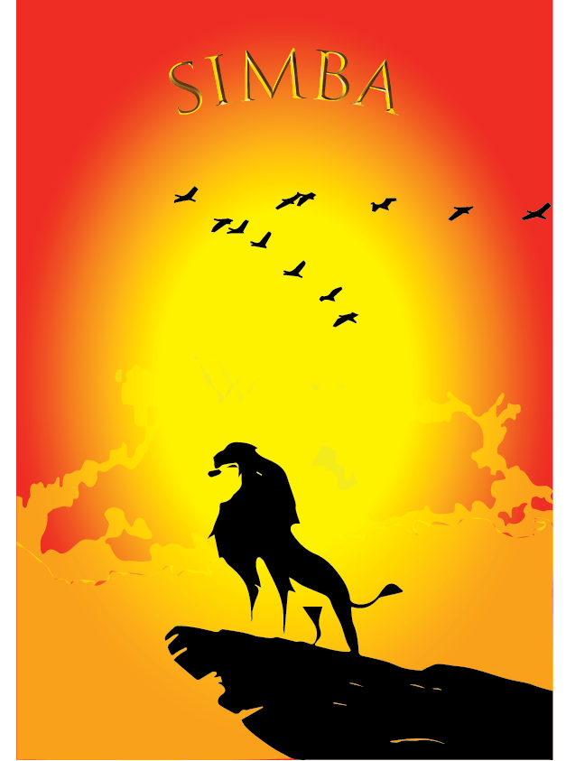
I worked on my 5th poster for this class.
This time I chose to design a poster for the Lion king movie.
I used image trace, gradient, text and many other tools taught to us.
The objective of this poster was for it to have a theme and be minimalistic yet appealing.
WEEK – 6
This class we were introduced to Adobe Photoshop.
To me, it was easier to grasp the photoshop tools as they were pretty similar to those of illustrator.
Having been briefly introduced to photoshop in the past it was easier for me to navigate my way around the software.
We started with the basic tools : move tool, selection tool, lasso tool, brush tool and many more.
It served as a good and much needed revision for me.
WEEK – 7
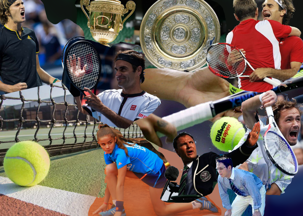
This week I created a collage using photoshop.
Tennis being my favourite sport, I decided to make a collage for the same.
I used a lot of components referring to tennis like the racket, tennis balls, the various surfaces it is played on (grass,clay and hard court), the Wimbeldon trophy, some of the famous players and an umpire.
I placed the images randomly but also in a manner that would show a flow.
I used the magic wand to eliminate the areas that weren’t needed or didn’t fit in.
I also tried to use images that fell in the same color palette so that they would blend in with each other better.
I had a lot of fun making this collage because I felt like I had the liberty with the placements and the composition in general.
WEEK – 8
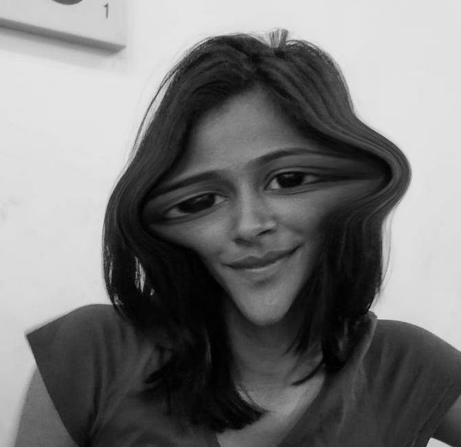
For this lecture I played around with the liquify tool in photoshop.
It made a lot of weird and interesting forms out of the images.
Not only was this instrumental for me to familiarize myself with the software but also it was very much amusing to be able to change the form of the image.
I took a photo of one of my friends and tried to make her look like an alien by making her face narrower and eyes wider.
I put black and white filter over it to give it a vintage look.
I had a lot of fun doing this and also got very well acquainted with the effects in photoshop.
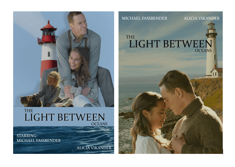
WEEK – 9
I recreated a movie poster for this class.
The light between oceans is a romantic drama based on a novel with the same title. The film tells the story of a lighthouse keeper and his wife who rescue and adopt an infant girl adrift at sea. Years later, the couple discover the child’s true parentage and are faced with the moral dilemma of their actions.
At first I was struggling with the placements and trying to figure out where to put all the elements. I was not happy with the first version of the poster as it looked very random and there was no flow in the poster itself.
I made a second poster for the same with different images this time and made sure they all fit in with each other.
This time the poster looked much better as all the elements had a similar color palette. I used the ‘Constantia’ font for the title of the movie and for the names of the actors as I found it to be fitting in very well.
1st POSTER vs 2nd POSTER
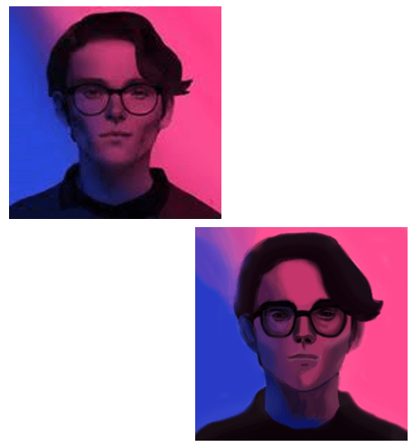
WEEK – 10
Making a portrait has always been daunting for me. Although I am comfortable painting on a paper, painting digitally was an uncharted area for me.
I decided to make a portrait of such an image that would have the tints and tones of 2 colors so as to make it a little easier for my first attempt.
The image that I chose was extremely blurry so it was a bit challenging to find the right colors.
I used the eyedropper tool to pick the right colors and then the brush tool to color the parts. In some parts that had a bigger area, I used the bucket tool to make the task easier and faster.
It wasn’t the perfect portrait but I was proud of it as it was my first attempt.
THE PHOTO AND THE PORTRAIT
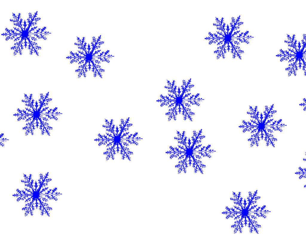
I also made my own brush on photoshop, I made a snowflake brush.
I started by first scanning an image of a snowflake on illustrator and then opening it in photoshop.
I then selected the image with the marquee tool and selected ‘define brush preset’ in Edit.
For the last step, I gave the brush a name and adjusting the settings in the ‘brush settings’.
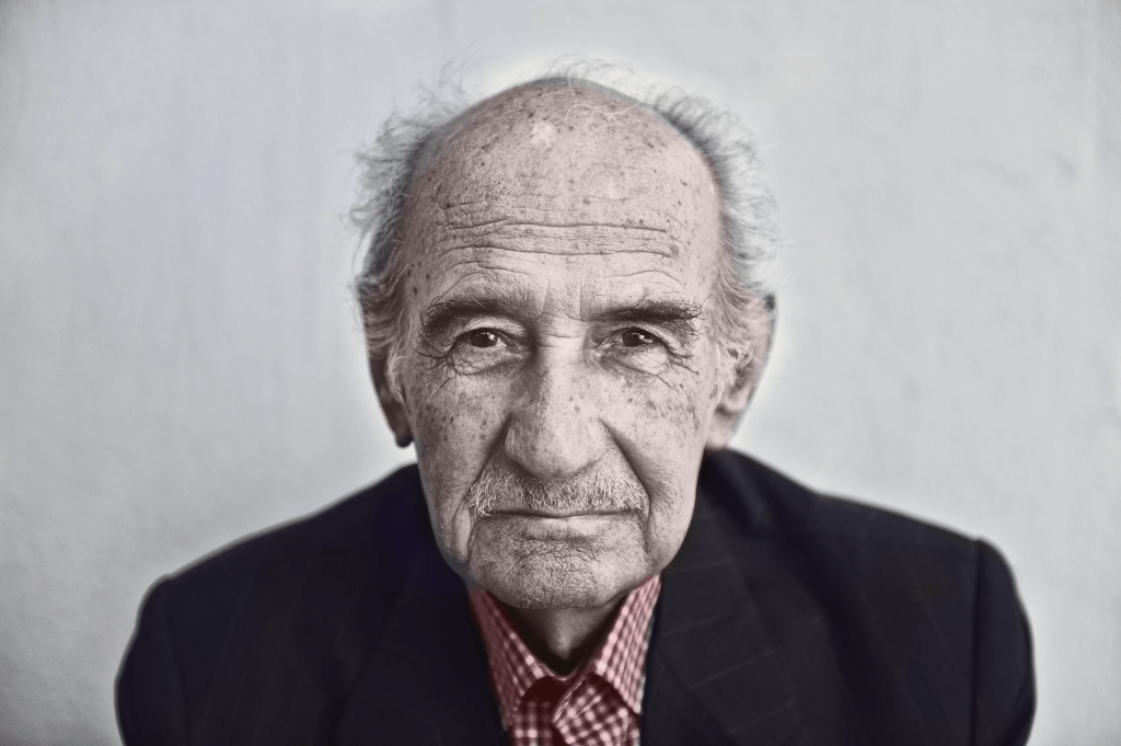
We also learned how to recolor a black and white image.
It was quite interesting to be able to transform an image completely.
I took a random black and white from the internet and started working on it.
I first made a duplicate layer of the original image and started making other layers between those two.
For each layer I made a layer mask and started coloring on it. I used a brush on the ‘soft light’ mode and adjusted the opacity as required. And this was the end result :
WEEK – 11
This week I started working on ideas for my zine.
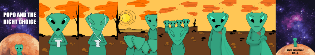
For my zine I chose the topic of ‘bullying’, as this topic is very personal to me.
I am hoping that I can draw from my own experience and convey my message in an impactful way while still keeping it lighthearted.
Bullying has a profound effect on a person’s mental and physical health. It can cause anxiety, depression and various other health issues.
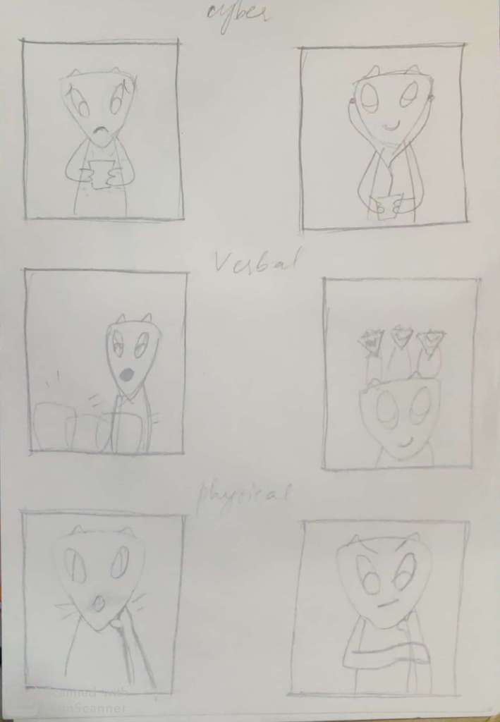
I am going to show the various types of bullying : cyber , physical and verbal bullying; and how one can overcome such situations.
I made some rough sketches as to map out my story for the zine.
WEEK – 12
This week I worked further more on my zine.
I first made thumbnails for each page of my zine. I then created a more detailed storyboard for the same.
Making a storyboard helped me understand the flow of my story for the zine.
I made 6 frames to depict my story. I chose 6 frames because I was confident I could convey my message appropriately through them.
WEEK – 13
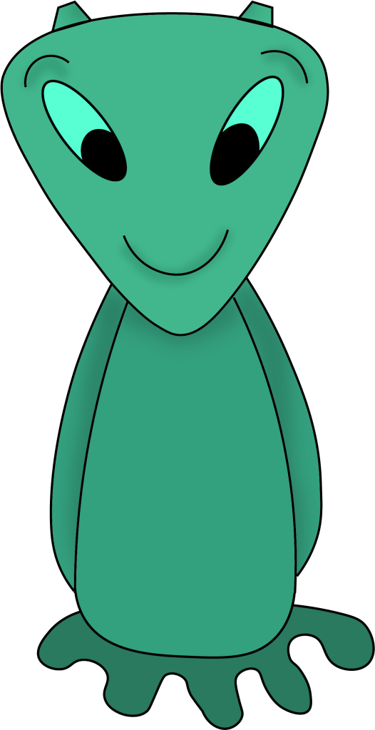
My zine started off with human characters and then I completely changed it into a different character.
I made my character an alien as I wanted to make it gender neutral. I also chose an alien because I wanted to take the feeling of being ‘alienated’ in the literal sense.
I named my character Popo the Pentapus.
I first worked on my character and after a few trials I finally had something that I was happy with.
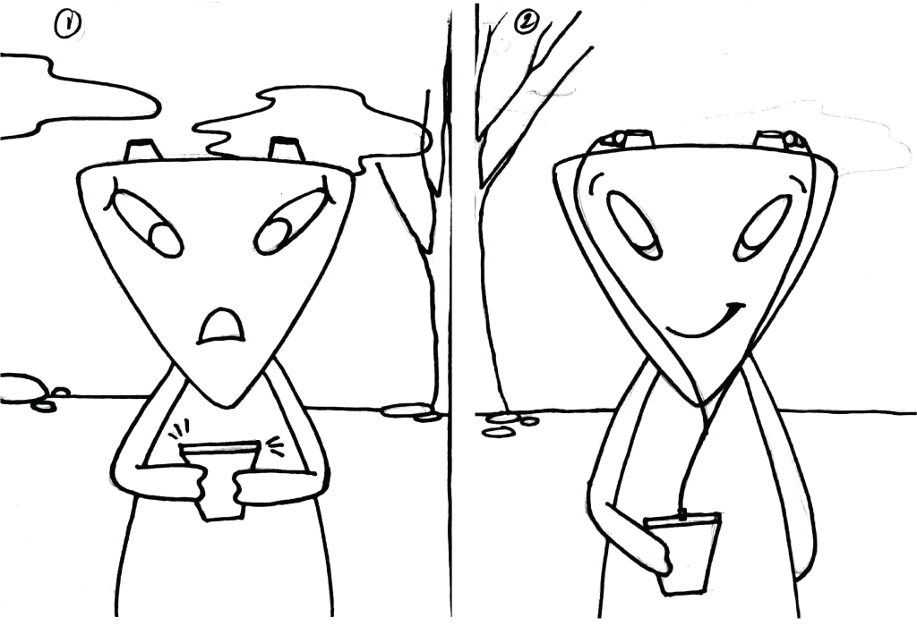
I then started making the drawings for the 6 frames and scanned them so I could use them as a guide while drawing them in illustrator.
WEEK – 14
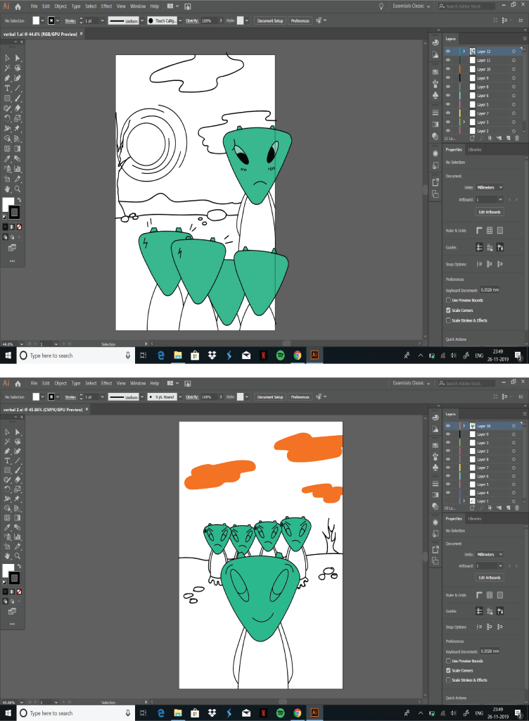
This week I started making frames for my digital zine.
I drew on illustrator and then exported the image as a vector so I could open that image on photoshop to fill the colors in.
In illustrator I used the pen tool, curve tool, ellipse tool and the brush tool. I filled some colors in illustrator and did the rest in photoshop.
I also made a clipping mask to remove any extra details that weren’t necessary.
I used the paint bucket tool to fill in the colors in photoshop.
After I was done coloring the frames, I used the burn tool to give shadows. Shadows added a much needed depth to my character.
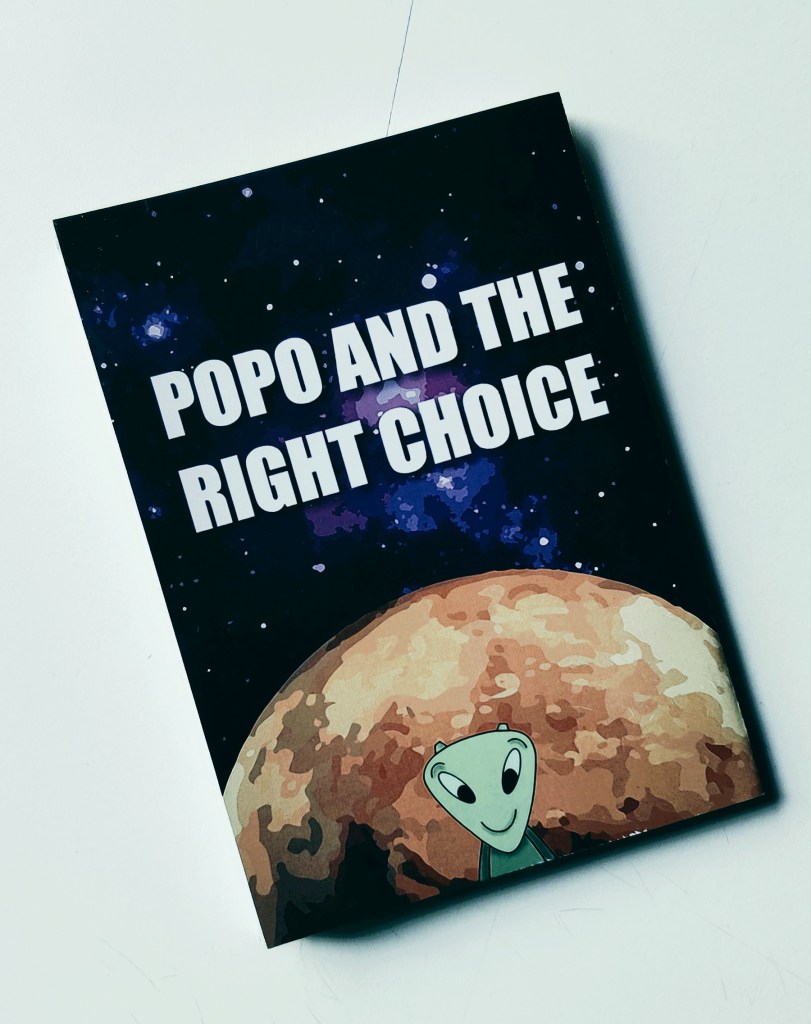
I made a cover page for my zine and titled it “Popo and the right choice”.
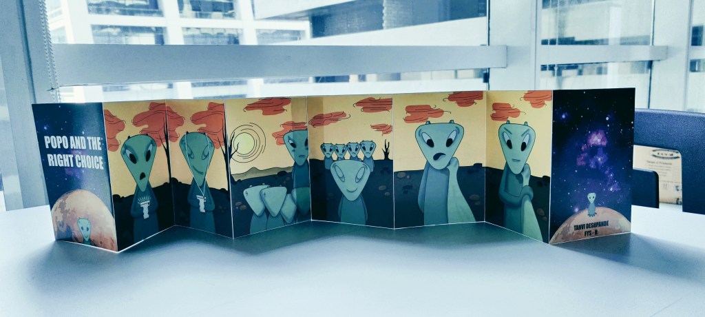
After my frames were completed, I arranged them in a sequence and printed a prototype.
WEEK – 15
For the final week, I made some changes in the zine before printing the main zine.
After printing a prototype I realized that there were a few things that needed some adjusting.
The sizes of all the frames were not exactly the same so I had to resize them and arrange them again. Then I printed the final zine in 2 halves on an A3 sized paper and joined them together.